Combination of santa and the painting banksy did on that wall in egypt of the girl with balloons. it wasn't really all that hard because i had a good idea of what i wanted to do.
Tuesday, December 20, 2011
Monday, December 19, 2011
Sweet box
Friday, December 16, 2011
Thursday, December 15, 2011
Wednesday, December 14, 2011
Sick Filters
Tuesday, December 13, 2011
Monday, December 12, 2011
Rad as heck
A cool grind by a cool guy named Shane O'Neal. This wasn't that hard for me because I've had a little bit of experience with this style of shops. I like it, it's cool. If i had a sequence of the shots I could have made it into little longer blur.
Friday, December 9, 2011
Tuesday, December 6, 2011
Dr. Wizowski
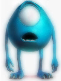
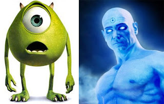 My cool disney crossover Mike Wizowski from Monsters Inc. and Dr. Manhattan from The Watchmen. They're two of my favorite characters so of course it was pretty easy to figure out. There really isn't much else i could do with the angle of the image i had with Mike. It turned out pretty cool and I'm pretty happy with it.
Monday, December 5, 2011
Would you like a slice of Kiwi?
Thursday, December 1, 2011
Sketchy
Madmashup mixtapes
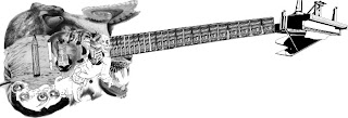 For my mashup image I started off with a Ephiphone Wilshire and layered various images on top to create a sick guitar. The images range from various sources such as pictures of cats, soup cans, and buildings. I like the way it turned out, I just wish it had more contrast and that the neck would align right. I probably spent well over an hour just trying to get the neck to look right.
Monday, November 21, 2011
OFWGKTA
A typography portrait of one of my favorite rappers Tyler, the Creator. THis took much much much much longer than i expected. I had lots of trouble with photoshop and fonts. I am also kinda sad that i could not get the shading in as well. It got finished and I'm pretty happy with it.
Monday, November 7, 2011
TUPAC TANTRUM
a radical image of george washington combined with politician Massimo d'Alema. i couldn't get it to work the way i wanted it to. i wnated to get the face to look like the oils look, but it uh eh didn't work. it's kinda funky and gives me the creeps.
Friday, November 4, 2011
MOONSTARS FROM THE MOON
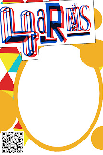
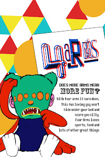
My monster's, Four Arms, box took a lot longer than I expected. I encountered a number of problems with sai and photoshop. I also and am not happy with how the drawing turned out. It's shading is off, and there are some white spots. :C I do like the box design a lot though. I tried to keep a very consistent theme and make it colorful and inviting.
Tuesday, November 1, 2011
Magazine Cover
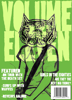 VOLUME ELEVEN!!!! The hit garage rock magazine that reviews instruments, interviews bands, and more!
It took a lot longer than I anticipated on the cover due to a problem I was having with my copy of Photoshop. I am pretty happy with it though. I got the idea for the style from band posters and skateboarding. I wanted to give it this raw feel like you were actually about to go see this band perform live.
Wednesday, October 12, 2011
Friday, October 7, 2011
Cupmation
CUP MATION WOOP WOOp
i made the chiptune loopy thing, and it needs a little redoing, but w/e.
i made the chiptune loopy thing, and it needs a little redoing, but w/e.
Tuesday, September 27, 2011
Mah phirst ANEWMETANTann
Our first animatation Project. I'm excited. Animation is my some thing i want to study more, but haven't really focused on.
Thursday, September 22, 2011
YEP
Tuesday, September 20, 2011
Another Photo Retouch
Monday, September 19, 2011
What Came out?
Boop boop editing thing
Tuesday, September 13, 2011
Wednesday, September 7, 2011
Colorize Project
Tuesday, September 6, 2011
Newimal
Thursday, September 1, 2011
Animals for Animorph Project
Cat-fuzzy, small, striped, fur, multicolored,
Cat: fuzzy: Corgi
Aye-Aye: long fingers, wiry, fur, black/grey, big eyes
Aye Aye: wiry: Gollum
Red Panda-orange and white, stocky, fluffy,
Red Panda: stocky: Corgi
Corgi-tan and white/brown, short legs, splotches, fur, stocky, no tail
Corgi: short legs: Kiwi
Armadillo-armored, grey, shiny,
Armadillo: armored: Turtle
Echidna-spikey, long snout, fat legs,
Echidna: Long snout: Anteater
Lynx- fur, white/brown, bob tail, big paws
Lynx: bob tail: Deer
Kiwi-flightless bird, brown, spikey feathers, long beak, short legs
Kiwi: flightless bird: Ostrich
Thorny Devil- reptile, spikes, brown/orange,
Thorny Devil: Spikes: Echidna
Pug-tan/black, dog, mushed in face, curly tail, fur, fat
Pug: fat: Koala
Hipsterland USA
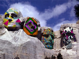 Our third Comp. Art project involved overlaying a pattern to a second picture. I chose to use a bunch of Aztec style patterns on top of Mount Rushmore. Everything went really smoothly for this. I originally was going to use a picture of a red panda, but after I wasted an entire class period trying to get it to look right, I gave up and switched to this.
Tuesday, August 30, 2011
Dat tounge!!!!
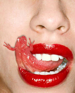 This second project we did was a lot of fun. We had to make someone's tounge in the shape of a frog. I was able to quickly make the tounge using the clone tool, however I did have some problems with the shadows(turned out to be a layering issue). Eventually it all worked out and this piece was born.
Subscribe to:
Comments (Atom)


